Could anyone please explain how CPS1 and CPS2 are used for r
Could anyone please explain how CPS1 and CPS2 are used for reliability standard. Thanks
Solution
In simple terms, CPS1 assigns each Control Area a “slice” of the responsibility for control of Interconnection frequency. The amount of responsibility is directly related to Control Area size.
ACE is to a Control Area what frequency is to the Interconnection. Over-generation makes ACE go positive and frequency increase. A large negative ACE causes frequency to drop. “Noisy” ACE causes “noisy” frequency. CPS1 captures these relationships.
The CPS1 equation can be simplified as follows:
CPS1 (in percent) = 100* (2 – (a Constant[1])* (frequency error)*(ACE))
Frequency error is deviation from scheduled frequency. Normally this is deviation from 60Hz. Scheduled frequency is different during a time correction, but for the purposes of this discussion, assume scheduled frequency is always 60 Hz.
Refer to the equation above. Any minute where the average frequency is exactly on schedule or Control Area ACE is zero, the quantity ((frequency error)*(ACE)) is zero. Therefore CPS1 = 100* (2-0). CPS1 is exactly 200% whenever frequency is on schedule or ACE is zero.
For any one-minute average where ACE and frequency error are “out of phase”, CPS1 is greater than 200%. For example, if frequency is low, but ACE is positive (tending to correct frequency error), the Control Area gets extra CPS1 points.
Conversely, if ACE is aggravating the frequency error, CPS1 will be less than 200%. CPS1 can even go negative.
The CONSTANT in the equation above is sized such that if a Control Area’s ACE is proportionally as “noisy” as a benchmark frequency noise, the Control Area will get a CPS1 of 100%. The minimum acceptable long-term score for CPS1 is 100%.
When CPS was established, each Interconnection was given a target or benchmark “frequency noise”. This target noise is called “Epsilon 1” or 1. Epsilon 1 is nothing more than a statistician’s variable that means the RMS value of the one-minute averages of frequency.
The target values (in millihz of frequency noise) for each Interconnection are shown in Table 1 below. The NERC Resources Subcommittee monitors each Interconnection’s frequency performance and can tighten (or loosen) the 1 values should an Interconnection’s frequency performance decline (improve).
Interconnection
Epsilon 1
Eastern
18.0
Hydro Quebec
21.0
Western
22.8
ERCOT
20.0
Table 1 Target Values of \"One Minute Frequency Noise\"
The Epsilon 1 target initially set for each Interconnection was on the order of 1.6 times historic frequency noise. This is why “average” Control Areas have been scoring around 160% for CPS1.
Let’s review how CPS1 data can be applied to measure the adequacy of control performance and the deployment of resources to meet load. NERC refers to these resources as Interconnected Operating Services (IOS). Although there are some differences in definitions, the FERC calls these resources Ancillary Services.
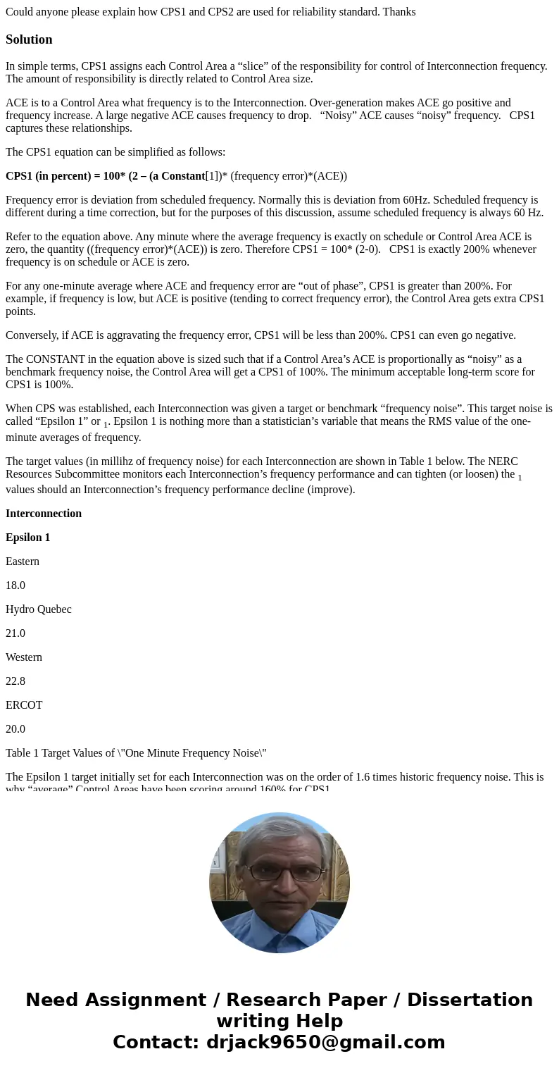
Figure 1 shows ACE charts for one hour for four different Control Areas. Compare the charts for Control Areas 1 and 2. Both Control Areas show good performance for the hour. The difference between them is that the load in Control Area 2 is “noisier”.
Control Area 3
Control Area 2
Control Area 1
Control Area 4
Figure 1 IOS/Ancillary Service Measured via CPS
The “bell curves” to the right of the ACE charts show the distribution of the individual one-minute CPS1 for both Control Areas for the hour. If frequency followed a normal pattern, whereby it fluctuated ± a few millihz from 60 Hz, the CPS1 curves for Control Area 1 and 2 would look like the “bell curves” to the right of their ACE charts. Both curves would have the same average (about 160% CPS1), but Control Area 2’s curve would be “wider.” In other words, the larger ACE swings would sometimes help frequency back to 60 more than Control Area 1, but sometimes hurt frequency more than Control Area 1.
Even though the average effect of Control Area 1 and 2 on the Interconnection is the same, Control Area 2 sometimes places a greater burden on the Interconnection, as demonstrated by the size of the “left hand tail” of the CPS1 curve. A very long left tail implies poor control of some type (in this case regulation).
Now look at Control Area 3. It is a “generation only” Control Area that is selling 100 MW for the hour. The problem is that it is meeting this requirement by generating 200 MW for the first 30 minutes and 0 MW for the last half of the hour. Again, if frequency conditions are normal, half the time the Control Area will be helping frequency back towards 60 Hz and half the time the Control Area will be hurting frequency. This means the Control Area will get an “Interconnection average” CPS1 score of about 160% for the hour. The graph of its CPS1 for the hour will, however, have wider tails, much like Control Area 2. The underlying problem in this case is Imbalance, not Regulation.
The ACE chart for Control Area 4 shows that a generator tripped offline during the hour. If the CPS1 one-minute averages are plotted, the curve will also have wider tails. If the unit that was lost was large, the curve will be “skewed” to the left even further. This is because the unit loss will pull frequency down while ACE is a large negative value.
In each case above there was a deficiency in one of the energy-based IOS (sometimes called ancillary services). The “left tail” of the underlying CPS1 curve captured each situation.
Review of Actual Hourly CPS1 Data
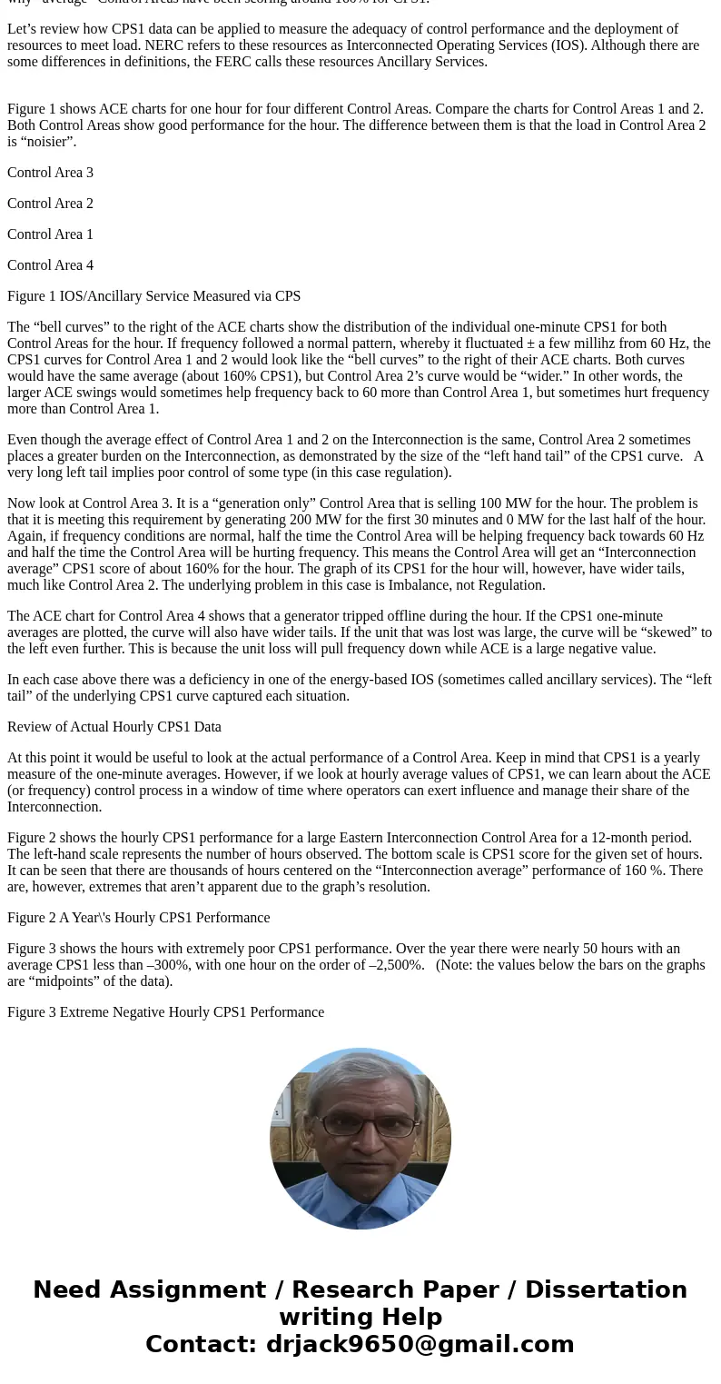
At this point it would be useful to look at the actual performance of a Control Area. Keep in mind that CPS1 is a yearly measure of the one-minute averages. However, if we look at hourly average values of CPS1, we can learn about the ACE (or frequency) control process in a window of time where operators can exert influence and manage their share of the Interconnection.
Figure 2 shows the hourly CPS1 performance for a large Eastern Interconnection Control Area for a 12-month period. The left-hand scale represents the number of hours observed. The bottom scale is CPS1 score for the given set of hours. It can be seen that there are thousands of hours centered on the “Interconnection average” performance of 160 %. There are, however, extremes that aren’t apparent due to the graph’s resolution.
Figure 2 A Year\'s Hourly CPS1 Performance
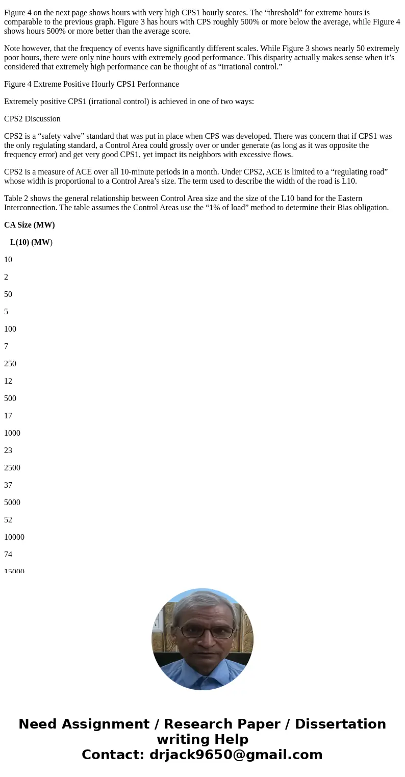
Figure 3 shows the hours with extremely poor CPS1 performance. Over the year there were nearly 50 hours with an average CPS1 less than –300%, with one hour on the order of –2,500%. (Note: the values below the bars on the graphs are “midpoints” of the data).
Figure 3 Extreme Negative Hourly CPS1 Performance
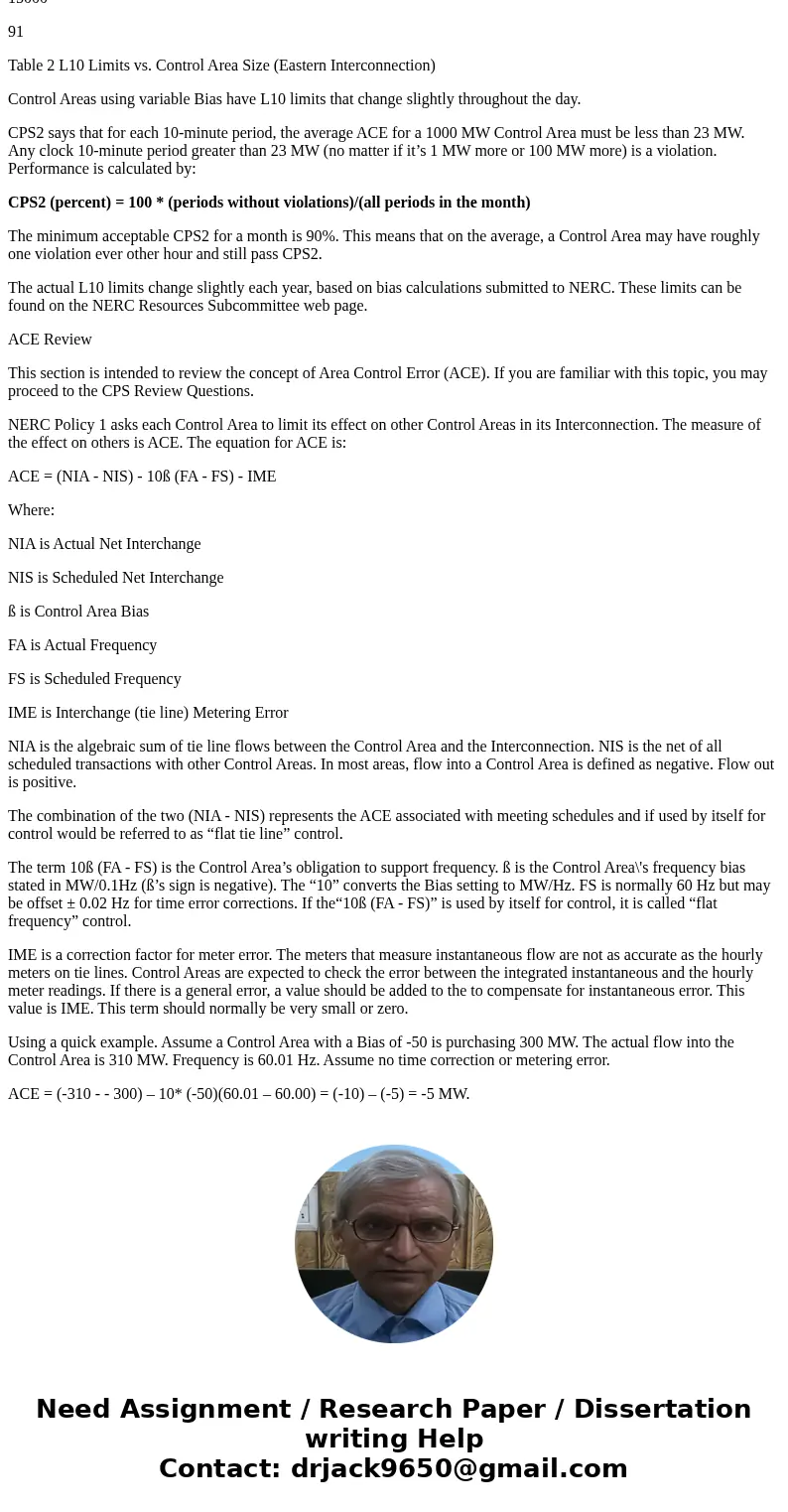
Figure 4 on the next page shows hours with very high CPS1 hourly scores. The “threshold” for extreme hours is comparable to the previous graph. Figure 3 has hours with CPS roughly 500% or more below the average, while Figure 4 shows hours 500% or more better than the average score.
Note however, that the frequency of events have significantly different scales. While Figure 3 shows nearly 50 extremely poor hours, there were only nine hours with extremely good performance. This disparity actually makes sense when it’s considered that extremely high performance can be thought of as “irrational control.”
Figure 4 Extreme Positive Hourly CPS1 Performance
Extremely positive CPS1 (irrational control) is achieved in one of two ways:
CPS2 Discussion
CPS2 is a “safety valve” standard that was put in place when CPS was developed. There was concern that if CPS1 was the only regulating standard, a Control Area could grossly over or under generate (as long as it was opposite the frequency error) and get very good CPS1, yet impact its neighbors with excessive flows.
CPS2 is a measure of ACE over all 10-minute periods in a month. Under CPS2, ACE is limited to a “regulating road” whose width is proportional to a Control Area’s size. The term used to describe the width of the road is L10.
Table 2 shows the general relationship between Control Area size and the size of the L10 band for the Eastern Interconnection. The table assumes the Control Areas use the “1% of load” method to determine their Bias obligation.
CA Size (MW)
L(10) (MW)
10
2
50
5
100
7
250
12
500
17
1000
23
2500
37
5000
52
10000
74
15000
91
Table 2 L10 Limits vs. Control Area Size (Eastern Interconnection)
Control Areas using variable Bias have L10 limits that change slightly throughout the day.
CPS2 says that for each 10-minute period, the average ACE for a 1000 MW Control Area must be less than 23 MW. Any clock 10-minute period greater than 23 MW (no matter if it’s 1 MW more or 100 MW more) is a violation. Performance is calculated by:
CPS2 (percent) = 100 * (periods without violations)/(all periods in the month)
The minimum acceptable CPS2 for a month is 90%. This means that on the average, a Control Area may have roughly one violation ever other hour and still pass CPS2.
The actual L10 limits change slightly each year, based on bias calculations submitted to NERC. These limits can be found on the NERC Resources Subcommittee web page.
ACE Review
This section is intended to review the concept of Area Control Error (ACE). If you are familiar with this topic, you may proceed to the CPS Review Questions.
NERC Policy 1 asks each Control Area to limit its effect on other Control Areas in its Interconnection. The measure of the effect on others is ACE. The equation for ACE is:
ACE = (NIA - NIS) - 10ß (FA - FS) - IME
Where:
NIA is Actual Net Interchange
NIS is Scheduled Net Interchange
ß is Control Area Bias
FA is Actual Frequency
FS is Scheduled Frequency
IME is Interchange (tie line) Metering Error
NIA is the algebraic sum of tie line flows between the Control Area and the Interconnection. NIS is the net of all scheduled transactions with other Control Areas. In most areas, flow into a Control Area is defined as negative. Flow out is positive.
The combination of the two (NIA - NIS) represents the ACE associated with meeting schedules and if used by itself for control would be referred to as “flat tie line” control.
The term 10ß (FA - FS) is the Control Area’s obligation to support frequency. ß is the Control Area\'s frequency bias stated in MW/0.1Hz (ß’s sign is negative). The “10” converts the Bias setting to MW/Hz. FS is normally 60 Hz but may be offset ± 0.02 Hz for time error corrections. If the“10ß (FA - FS)” is used by itself for control, it is called “flat frequency” control.
IME is a correction factor for meter error. The meters that measure instantaneous flow are not as accurate as the hourly meters on tie lines. Control Areas are expected to check the error between the integrated instantaneous and the hourly meter readings. If there is a general error, a value should be added to the to compensate for instantaneous error. This value is IME. This term should normally be very small or zero.
Using a quick example. Assume a Control Area with a Bias of -50 is purchasing 300 MW. The actual flow into the Control Area is 310 MW. Frequency is 60.01 Hz. Assume no time correction or metering error.
ACE = (-310 - - 300) – 10* (-50)(60.01 – 60.00) = (-10) – (-5) = -5 MW.
The Control Area should be generating 5 MW more to meet its obligation to the Interconnection.
[1] The size of this constant changes in over time for Control Areas with variable bias, but this effect can be ignored when considering minute to minute operation.
 Homework Sourse