httpdpcdsbgainswikispacescomfileviewWorstGraphsEverpdf Ident
http://dpcdsb-gains.wikispaces.com/file/view/Worst+Graphs+Ever.pdf
Identify the two variables being graphed. What types of variables are they? What is the level of measurement for each of the variables?
What method would you use to collect data for this graph? Why would you use this particular method?
What type of graph is displayed? If you could use any type of graph other than the one shown, what type of graph would you use? Why?
After looking at this graph, would you want to attend Cornell University? Why? What message does this graph convey to you? How might this graph be misleading?
Describe at least three things that are wrong with the graph.
Find an example of a misleading graph online. Post a link to the graph, and briefly discuss the qualities of the graph that made it misleading.
Solution
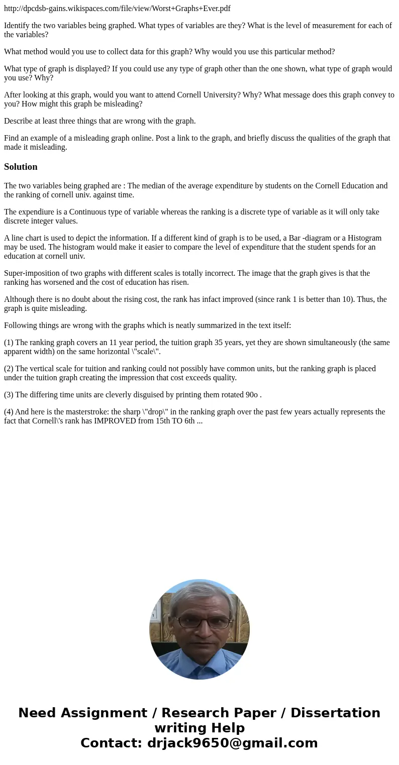
The two variables being graphed are : The median of the average expenditure by students on the Cornell Education and the ranking of cornell univ. against time.
The expendiure is a Continuous type of variable whereas the ranking is a discrete type of variable as it will only take discrete integer values.
A line chart is used to depict the information. If a different kind of graph is to be used, a Bar -diagram or a Histogram may be used. The histogram would make it easier to compare the level of expenditure that the student spends for an education at cornell univ.
Super-imposition of two graphs with different scales is totally incorrect. The image that the graph gives is that the ranking has worsened and the cost of education has risen.
Although there is no doubt about the rising cost, the rank has infact improved (since rank 1 is better than 10). Thus, the graph is quite misleading.
Following things are wrong with the graphs which is neatly summarized in the text itself:
(1) The ranking graph covers an 11 year period, the tuition graph 35 years, yet they are shown simultaneously (the same apparent width) on the same horizontal \"scale\".
(2) The vertical scale for tuition and ranking could not possibly have common units, but the ranking graph is placed under the tuition graph creating the impression that cost exceeds quality.
(3) The differing time units are cleverly disguised by printing them rotated 90o .
(4) And here is the masterstroke: the sharp \"drop\" in the ranking graph over the past few years actually represents the fact that Cornell\'s rank has IMPROVED from 15th TO 6th ...

 Homework Sourse