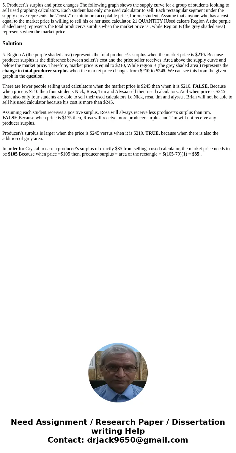
5 Producers surplus and price changes The following graph sh
Solution
5. Region A (the purple shaded area) represents the total producer\'s surplus when the market price is $210. Because producer surplus is the difference between seller\'s cost and the price seller receives. Area above the supply curve and below the market price. Therefore, market price is equal to $210, While region B (the grey shaded area ) represents the change in total producer surplus when the market price changes from $210 to $245. We can see this from the given graph in the question.
There are fewer people selling used calculators when the market price is $245 than when it is $210. FALSE, Because when price is $210 then four students Nick, Rosa, Tim and Alysaa sell their used calculators. And when price is $245 then, also only four students are able to sell their used calculators i.e Nick, rosa, tim and alyssa . Brian will not be able to sell his used calculator because his cost is more than $245.
Assuming each student receives a positive surplus, Rosa will always receive less producer\'s surplus than tim. FALSE,Because when price is $175 then, Rosa will receive more producer surplus and Tim will not receive any producer surplus.
Producer\'s surplus is larger when the price is $245 versus when it is $210. TRUE, because when there is also the addition of grey area.
In order for Crystal to earn a producer\'s surplus of exactly $35 from selling a used calculator, the market price needs to be $105 Because when price =$105 then, producer surplus = area of the rectangle = $(105-70)(1) = $35 .

 Homework Sourse